How to Make Small Rooms Look Bigger with the Right Paint Colours
Share This Blog

Small rooms get a bad reputation. They’re called “cramped,” “tight,” or worse—“awkward.” But here’s the truth: most small rooms don’t actually lack space. They lack strategy. And more often than not, the quickest way to fix that isn’t knocking down walls, it’s choosing the right paint colours and applying them properly.
Paint, when used thoughtfully, has an uncanny ability to stretch walls, lift ceilings, and change how a room feels the moment you step inside. Let’s break down how to make small rooms look bigger, brighter, and far more intentional with colour choices that work and techniques that elevate the final result.

Light Colours Are Powerful, but Only If You Use Them Right
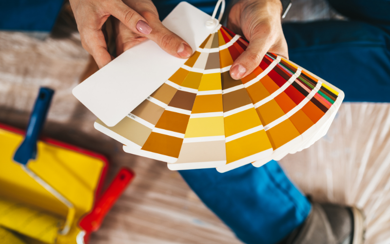
Yes, light colours reflect more light and help rooms feel open. That part isn’t new. What many people overlook is which light colours actually work.
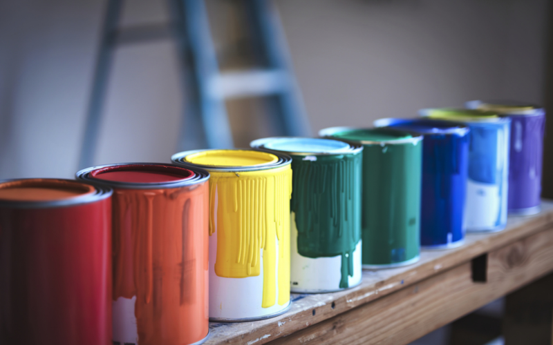
Crisp whites with warm undertones, soft greiges, pale taupes, and muted pastels tend to perform better than stark, flat whites. Pure white can sometimes make a small room feel cold or unfinished, especially under artificial lighting.
The key is consistency. When walls, trims, and ceilings sit within the same colour family, the eye moves uninterrupted. Fewer visual breaks mean the room feels larger, calmer, and more cohesive.
This is where precise masking techniques matter. Clean, sharp lines between walls and trims prevent the room from feeling choppy. Sloppy edges instantly shrink a space no matter how good the colour is. Learn how to get crisp, clean paint edges like a pro here.
Dark Colours Aren’t the Enemy (If You Know Where to Use Them)
Here’s a counterintuitive truth: dark colours can actually make small rooms feel bigger when used strategically.
A darker accent wall can create depth, making the room feel longer rather than boxed in. Deep blues, charcoal greys, or rich earthy tones work especially well behind beds, sofas, or shelving units.
The trick is restraint. One focal wall is enough. Pair it with lighter surrounding walls to keep the room balanced.
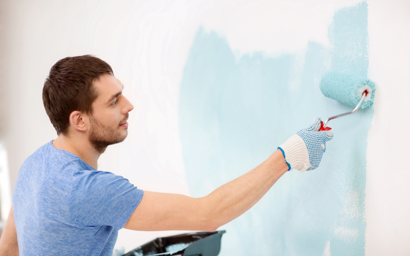
Brush control becomes critical here. Dark colours highlight uneven strokes and patchy coverage far more than light shades. Smooth, confident application ensures the wall looks intentional, not heavy.
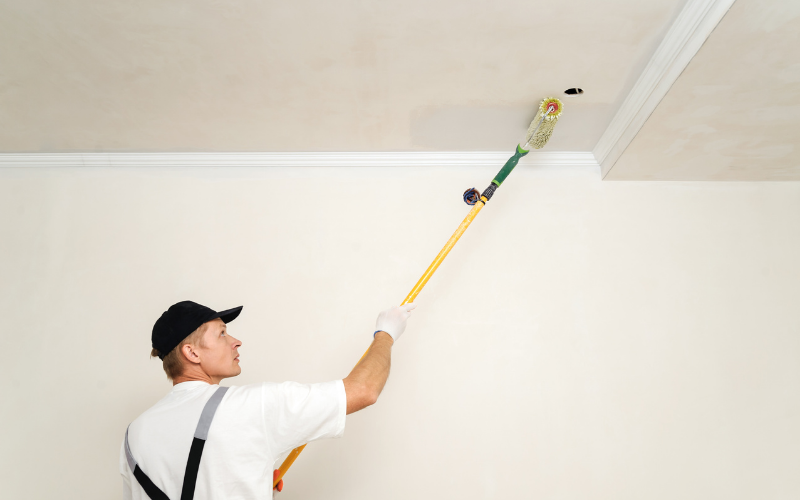
Don’t Ignore the Ceiling—It’s Your Secret Weapon
Most people paint ceilings white and move on. That’s a missed opportunity.
Painting the ceiling one or two shades lighter than the walls visually lifts it, creating the illusion of height. In very small rooms, carrying the wall colour up onto the ceiling especially in soft, light tones can blur boundaries and make the space feel taller.
This technique demands careful execution. Poor cutting-in around ceiling edges will undo the entire effect. Proper masking techniques and steady brush control are what separate a rushed paint job from professional-looking results.
Vertical and Horizontal Colour Tricks That Actually Work
Paint placement can manipulate how a room is perceived:
- Vertical colour continuity (same colour from floor to ceiling) makes rooms feel taller
- Horizontal separation (lighter upper walls, slightly darker lower walls) can widen narrow rooms
- Painted trims in the same colour as walls reduce visual clutter and expand the space
Each of these approaches works because they guide the eye deliberately. But again, the illusion only holds if the application is clean. Uneven edges or visible overlaps break the effect instantly.
Finish Matters More Than You Think
Colour gets all the attention, but finishing quietly does the heavy lifting.
Low-sheen or matte finishes absorb light and hide imperfections—ideal for small rooms with uneven walls. Satin finishes reflect a bit more light and work well in compact spaces that need brightness without glare.
Regardless of finish, achieving professional-looking results comes down to preparation, controlled strokes, and patience. Rushed painting shows. Thoughtful painting elevates everything.
Small Room, Smart Choices
Making a small room look bigger isn’t about tricks or trends. It’s about understanding how colour, light, and technique work together. The right shade opens up a space. Clean masking techniques keep lines crisp. Strong brush control ensures every wall looks intentional. And when all three align, the room doesn’t just look bigger it feels better to live in.
Because at the end of the day, great paint isn’t about covering walls. It’s about transforming how a space feels the moment you walk in.
SMP Colour & Paint Specialist
Sharing practical house painting tips, smart techniques, and real-world industry insights.
Table of Contents
Share this blog
Share your thoughts
More Tips & Tricks

Painting During Malaysia’s Rainy Season? Avoid These Costly Mistakes
Think cheap paint saves money? Learn why low-cost paint can...
Read More
Cheap Paint Can Cost More in the Long Run: Here’s Why
Think cheap paint saves money? Learn why low-cost paint can...
Read More
Cracks on Your Walls? What They Could Be Telling You About Your Home
Think cheap paint saves money? Learn why low-cost paint can...
Read More

